 Recommended by DeWitt Cheng:
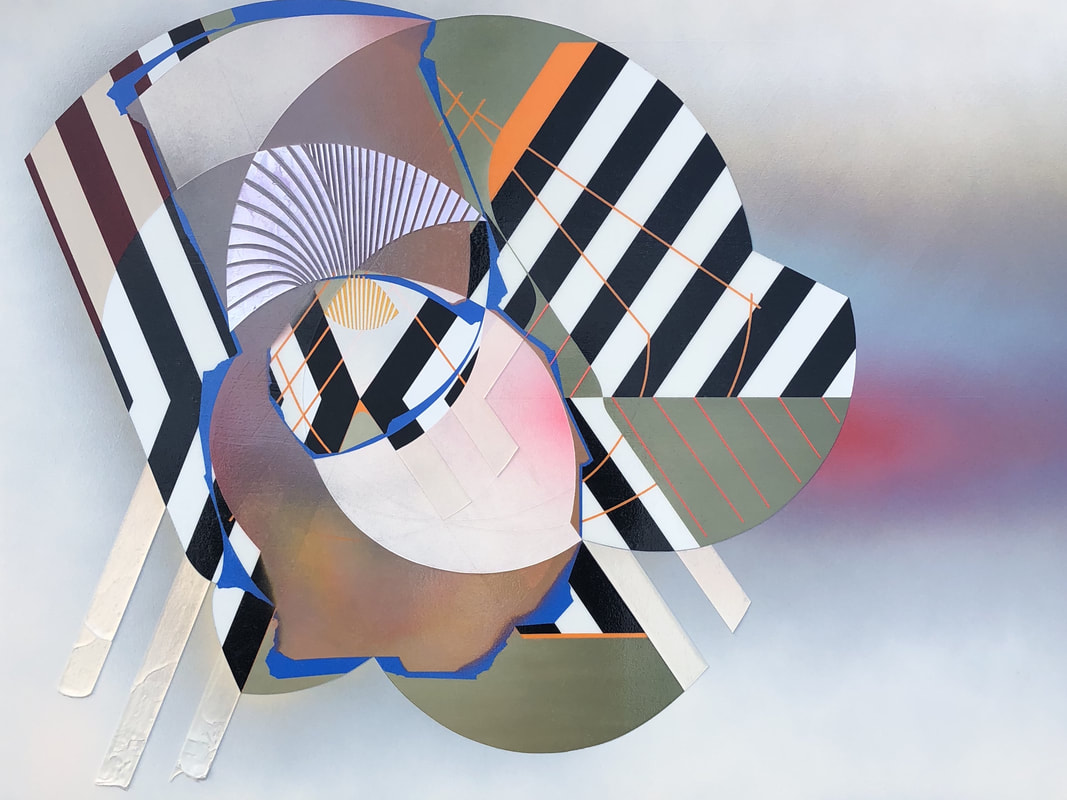
Alex Couwenberg has chosen the title “Chevrons,” referring to the V- or caret-shaped motif in heraldry that most of us associate with the Chevron gasoline logo, with its nestling red and blue V shapes; a sergeant’s stripes, with three gold carets; or Kenneth Noland’s “Chevron” series of hard-edged abstract paintings made in the early 1960s. But while Couwenberg is influenced by crisply delineated shapes faultlessly rendered, these works adopt the spatial ambiguity of cubism, with abstract forms suggesting overlapping architectural plans or machine parts in a temporary balance. Couwenberg: “The additive and reductive processes of my paintings reveal compositions of densely layered forms and patterns that weave in and out of each other, suggesting space, time, and the moment.” While Noland’s “Chevron” paintings propounded an aesthetic of radical purity, Couwenberg’s works, despite their Southern California design clarity (related to automobile and surfing culture), reflect the current cultural moment of diversity and uncertainty. His use of alternating black and white stripes suggest modernist architecture, herringbone fabric and super graphics. We think, too, of shadow patterns used to cinematic effect in film noir, which was so often set in the City of the Angels. Mysteriously beautiful forms, with their multiple associations, seem to float in shallow space, set off by airbrushed shadows and halations. Ruler-straight lines and compass-perfect curves —sometimes flat, but sometimes rendered in low-relief gel-heavy acrylic that looks like collaged cardboard, wood or plexiglas — are contrasted with irregularities. Such broken forms and brief passages of impasto emerge from the flat, otherwise pure picture plane. Couwenberg’s titles, such as “Bombardier,” “Mai Tai” and “Pleasure Seeker,” convey an ironic 1960s vibe. His use of color, while lush, is modulated and shadowed. These icons are fascinating both for their complexity and contradiction.
1 Comment
 Reviewed by Andy Brumer for Visual Art Source:
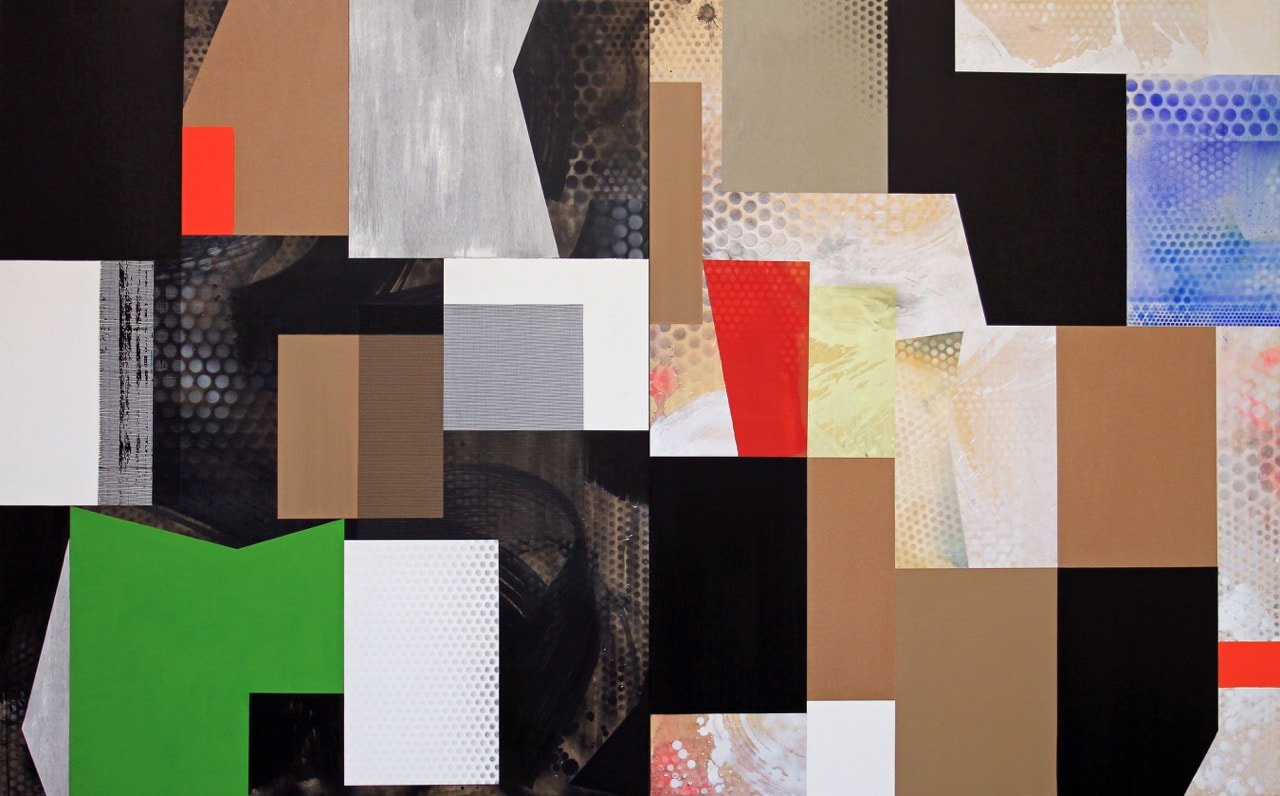
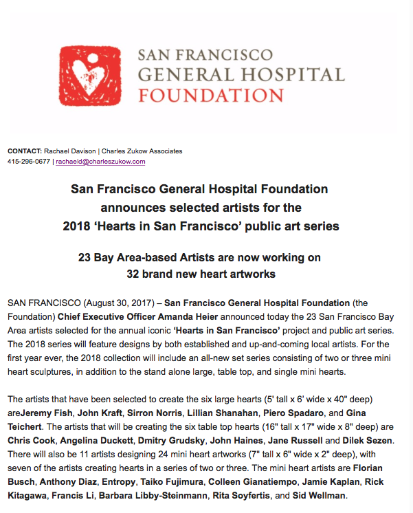
Ned Evans’ colorful and masterly executed acrylic and mixed-media geometric abstractions treat us to a painterly turbo-charge bouquet of color, texture, composition and feeling. The artist uses multiple wood panels in these paintings, to which he affixes pre-cut geometrically shaped pieces of cloth, paper, plastics and other fabrics. All are seamlessly assembled. Evans textures many of these strips, squares and other rectangular materials with granulated sand-like additives (similarly to Tapies, Dubuffet, Braque and others). If many viewers will miss seeing the underlying cohesive element at work here in the midst of the constructivist Boogie Woogie movement and kaleidoscopic blur, they will certainly, if only subconsciously, feel it. There’s also a studied color field tone poem feeling to Evans’ compositions that is counterbalanced by a jazz musician’s improvisational, supple and swift decision-making process. When integrated by the artist’s experienced eye and hand the combined gestalt of these elements, which meet the eye so simply yet represent a high order of visual organization, the paintings possess Schiller’s schein. The gallery director’s office walls support a small group of Evans’s Cubistic sculptural reliefs titled “Keyholes.” Each consists of four blocks of thick foam painted with resin and encaustic oils. These frame more than encircle small, centrally positioned empty spaces, the “Keyholes,” and while feeling childlike and tender the pieces trigger the double entendre of piano keys. One can almost hear Thelonious Monk-like clunky iconic and ingenious solos emanating from them. Such serenading adds a welcome background accompaniment to the primary bodies of work in the main galleries. Artist Piero Spadaro selected to create a Heart for San Francisco General Hospital Foundation2/6/2018 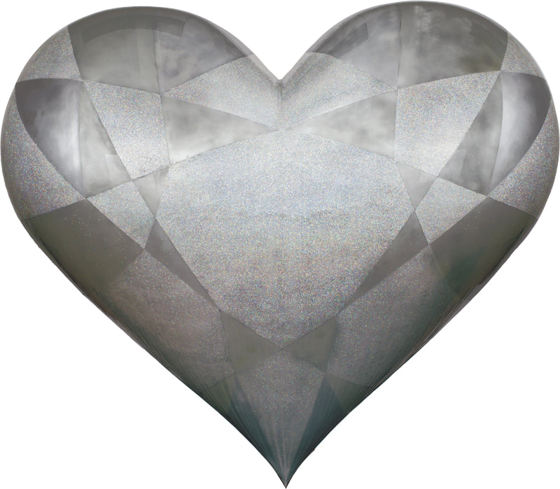 Since its inception in 2004, The Hearts of San Francisco project has been dedicated to both raising money for the San Francisco Hospital Foundation and supporting local artists. They meld these interests by commissioning creatively rendered, large-scale hearts from Bay Area artists and selling them at auction. These decorative hearts are littered throughout the city and are also featured in private homes and businesses. It is an immense honor for an artist to be selected to create a Heart, and today we celebrate one of our own, Piero Spadaro, on his Heart, which he has cheekily dubbed, “Bae Area”. Congratulations Piero! His sculpture will be available for viewing at the San Francisco Hospital Foundation Heroes & Hearts luncheon at AT&T Park on February 15th.
 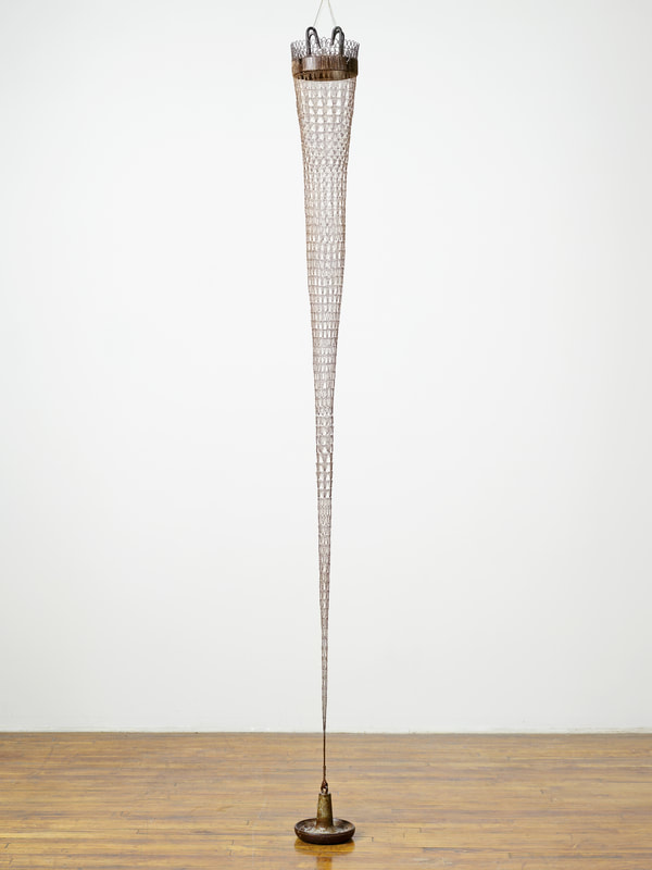 Tracy Krumm, Taper (Anchor), crocheted and fabricated metal, found objects - 108 x 10 inchesMathematics has been a profound source of inspiration for artists across time and cultures. In Seeing Math, contemporary artist, Tracy Krumm along with six others, address a number of mathematical concepts, including infinity, algorithms, geometry, and the fourth dimension. Opening Reception Friday, November 10, 2017, 5–7 p.m., Remarks 5:30 p.m. Flaten Art Museum, Center for Art and Dance Runs from November 10, 2017 – January 15, 2018 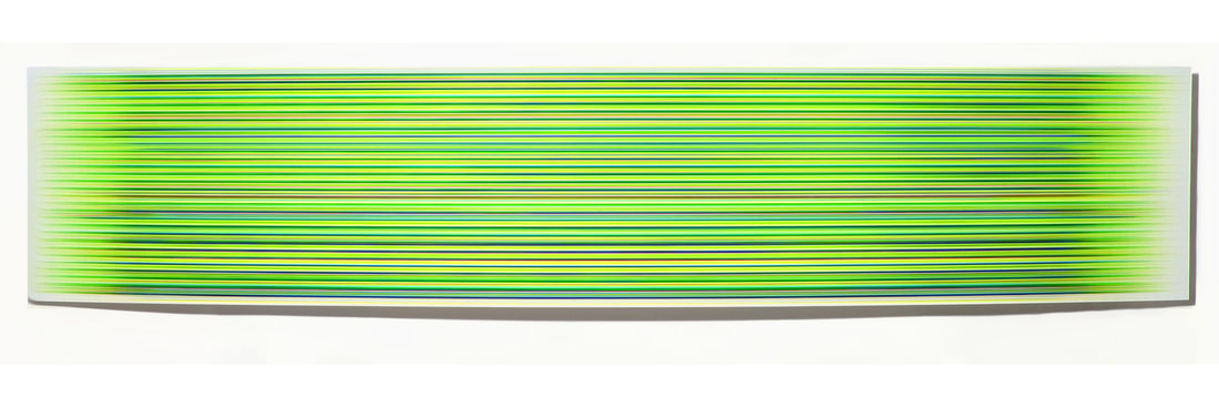  The two artists whose pieces receive the most votes will move on to the finale at SCOPE Miami Beach for a chance to be named the Artisan Series grand prize winner. Vote now through November 7, 2017 at: https://www.bombayartisan.com/ 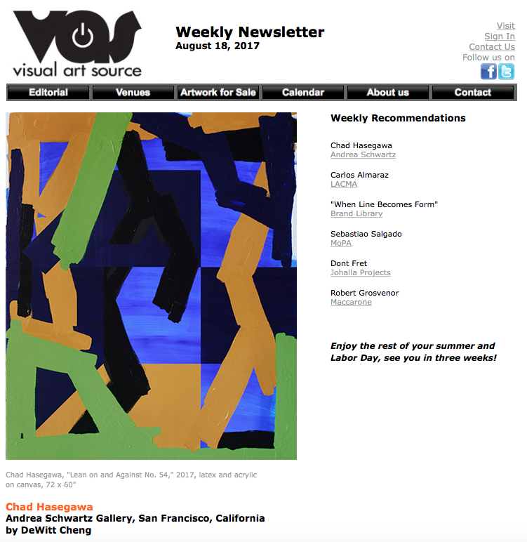 Recommendation by DeWitt Cheng
Continuing through August 31, 2017 The San Francisco satirist Ambrose Bierce defined painting as “the art of protecting flat surface from the weather and exposing them to the critic.” San Franciscan Chad Hasegawa, known for his mural work, has created a body of abstract paintings on canvas that focuses on the issues of working outside (although, curiously, there is no mention of exposure to sidewalk critics): i.e., dealing with “wind, dust, and all angles of direct sunlight of all hours of the day.” Hasegawa aims for long-term survival “as if [the works] were outside in heavy conditions” — as well as for the immediate visual impact necessary for the street. These large latex (“bucket paint”) and acrylic works, with their geometric shapes, eccentric and sometimes complex, suggesting three dimensions; their taped edges; and their textured paint, are monumental, in accordance with the artist’s admiration for the abstract expressionists Franz Kline, Phillip Guston, Joan Mitchell and Robert Motherwell; yet they’re also personal, befitting their inspiration in the traditional quilts of the artist’s native Hawaii, where these handmade objects are regarded as serious artifacts (as some of us continue to regard paintings). Hasegawa’s palette derives from the “royalty colors” of Hawaiian kings and queens, as do his high-contrast graphic compositions, which derive not from the natural world, as do traditional quilts, but today’s cultural world, and personal associations. Four small paintings, “Kahuku,” “Waianae,” “Haleiwa” and “Kapo Lei,” aligned vertically, constitute a symbolic map of four districts of Honolulu. The large works from the "Lean On & Against" series exemplify Hasegawa’s aesthetic of harmony through contrast, of painterly intuition layered into dynamic equipoise. |
Archives
October 2022
|

 RSS Feed
Andrea Schwartz Gallery545 4th Street, San Francisco, CA 94107 | 415.495.2090 | [email protected]
|
 |