|
Unlike those who struggle to find their passion in life, the path appears to have been always clear for San Francisco-based Piero Spadaro. “It came as no real surprise,” said Spadaro, “that the only colleges I applied to were art schools.” At Urban School, “an arts magnet high school in the Haight,” he worked with well-established artists, like Jennifer Starkweather and Kate Randall, who encouraged him to attend the arts-focused Oxbow School in Napa.
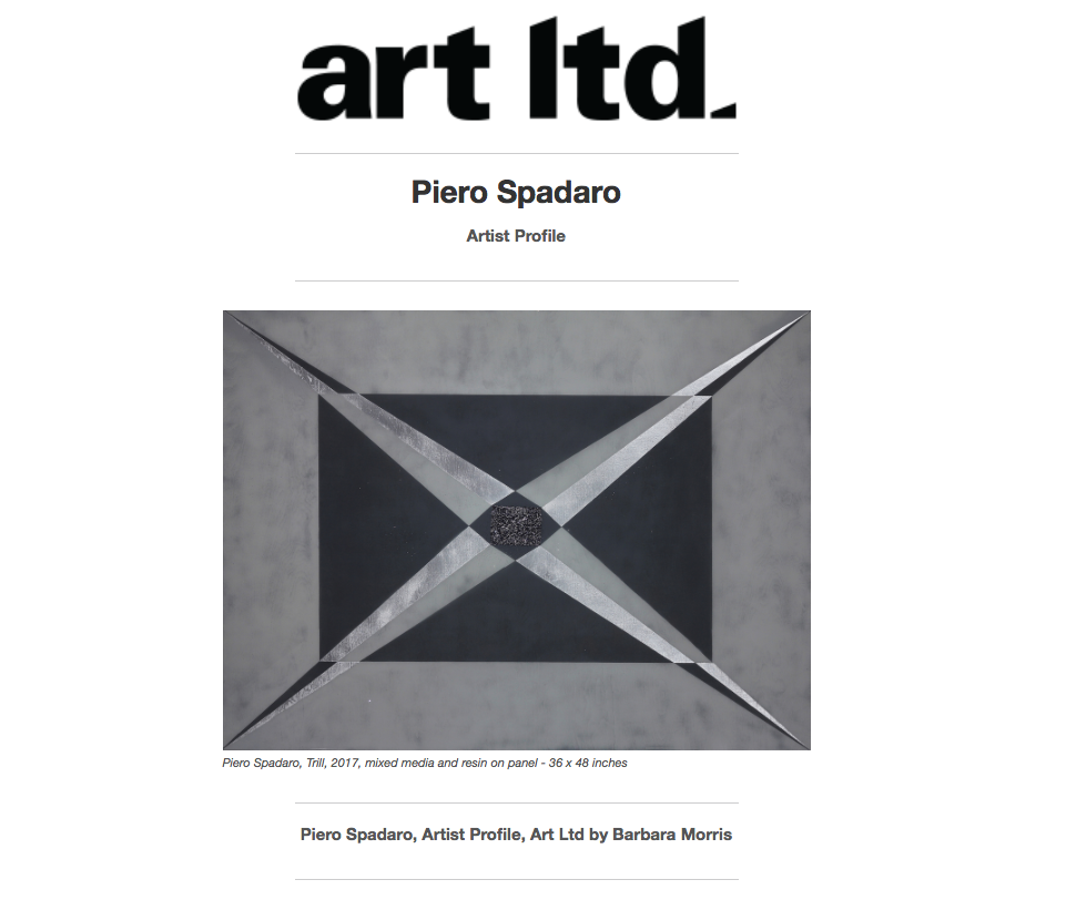
At Oxbow, Spadaro was won over by a recruiter from MICA, the Maryland Institute College of Art. “Baltimore is a challenging city in a lot of ways... it’s a very heated environment. But in the end we had a lot of freedom—I was able to really experiment.” While etching was his first love, for his senior thesis he created a body of silkscreen prints inspired by the experience of living in a country under the shadow of war. “I was interested in the idea of commemoration, and how night footage of bombings looked just like fireworks... in how we perceive things, the role of media, and kitsch.” He recalls, “So for my thesis I did a series of explosions in glitter, on black vel- vet. Pretty wild, because they enticed you in and then they bit you.” Spadaro acknowledges a connection to Warhol, who similarly used screen printing, with glitter or diamond dust—and often tackling dark subject matter—also mentioning the work of Michael Mazur as being of particular significance, “but I really fell in love with Goya, with ‘The Disasters of War.’” Moving back to San Francisco when he graduated, Spadaro’s process- oriented painting technique has evolved from his printmaking experience. Spadaro created a series of abstract works in mixed- media on panel, including French Enamel Varnish, or FEV—shellac thinned down with denatured alcohol, and mixed with dyes or pig- ments. Many of these earlier works “are about signifiers, for example how a horizontal line implies the horizon, and therefore landscape,” perhaps churning masses of ultramarine adjacent to a calmer area of blue-black “where the blue of the sky meets the blue of the sea...” Continuing to explore the use of glitter, he also began to use acrylic resin in some of the work. Spadaro recently mounted a one-man exhibi- tion, “Razzle Dazzle,” at Andrea Schwartz Gallery. While coming up with ideas for a new series, Spadaro was watching an antiques road show about camouflage techniques used in World War I. “It was about what they called ‘Razzle Dazzle’ camouflage,” designed to mask the bow and stern of the boat. “I loved the idea of it being hidden by being blatant,” he explains, adding that “the cubists felt slighted for not being given credit for its devel- opment,” since the patterns used related so strongly to their work. “Ultimately,” he laughs, “it was not deemed a success in any way.” Researching the term further, Spadaro kept finding more and more references to the phrase in the context of over-the-top fashion and jewelry; enjoying the double meaning, Spadaro brings pop culture into play with contemporary references to the blinged-out or hip in his titles. The enthusiastically-titled YAAAAAS (2017) places an art-deco-looking band of dark purple shapes, elongated dia-monds and triangles, atop a field of brilliant magenta-hued glitter. We may lose ourselves in the areas of diffusion, or meditate on the pat- tern on repeat. Firmly grounded in the tradition of color field painting, with areas of staining meeting more dense passages of pigment, YAAAAAS offers an optical treat as the warm purple glitter sparkles atop an underpainting in a dull, greenish-gold color, the pair mixing visually to create an unusual, vibrating hue. One of the most striking works is On Fleek (2017), a large-scale work in a pale blue green, “the color taken from the tourmaline.” The title phrase, derived from “fly” and “sleek,” and originally relating to shaping the eyebrows, suggests anything that is, as Spadaro puts it, “really well put together... over-coiffed.” With concentric rectangles in shades of gray sug- gesting a portal to another dimension, Spadaro notes as well that the geometric elements are drawn from the world of gemstone cutting, “this one is the emerald cut.” With brilliantly- hued passages of glitter encased in sparkling coats of resin, these works are themselves, quite simply, dazzling. “There is definitely an idea of meditation, or the mandala, inherent in the practice.” Spadaro reflects “For myself, I need to create light. There’s a lot of dark out there right now. The way the works capture, bounce and essentially emit light—that, I hope, is the gift.” —BARBARA MORRIS
0 Comments
Leave a Reply. |
Archives
October 2022
|
Andrea Schwartz Gallery545 4th Street, San Francisco, CA 94107 | 415.495.2090 | [email protected]
|
|


 RSS Feed

